Product · KadoKawa Corp.
Creator Center Redesign
Using mixed-methods research to cut through competing team priorities — and redesign a creator dashboard that actually reflects what creators need.
Role
Product Manager
Timeline
Jun 2023 – Jul 2025
Company
KadoKawa Corp.
Research
258 surveys · 4 interviews
TL;DR
16.3%
Boost in chapter editing rate after redesign
258
Survey responses collected across the creator ecosystem
4
In-depth creator interviews, selected to maximize profile diversity
↑
Certified Author application rate, creator education blog usage, and cross-departmental alignment — all improved
Context
A dashboard that hadn't been touched in two years
KadoKado's Creator Center is the primary interface where novel writers manage their works, track performance, and interact with the platform. After 2+ years without a redesign, it had accumulated significant technical debt — key workflows required excessive steps, and creators were disengaged with features that should have been central to their experience.
I led this project as the PM, owning the research strategy, feature prioritization, and redesign direction.
Problem
A product problem that had become a politics problem
The Creator Center had accumulated issues across two dimensions simultaneously:
Product
Technical debt and fragmented UX
2+ years without a redesign meant key feature operations required excessive steps. Data showed suboptimal engagement, but feedback from community channels was highly fragmented — vocal and unrepresentative. We had signal but no synthesis.
Organizational
Every team believed their feature was highest priority
The Creator Center had become a contested surface — content team, marketing, and engineering each had different views on what needed fixing most. Without a shared, evidence-based framework, there was no way to resolve competing priorities or commit resources to a redesign.
Before redesigning anything, we needed to understand the creator ecosystem systematically — and generate data that could speak for users when teams couldn't agree.
My Approach
Research first — then redesign
The instinct in a busy product org is to start building. I pushed for research first — not to slow things down, but because the cost of building the wrong thing was higher than the cost of a 2-week study.
Survey — understand the ecosystem at scale
258 valid responses collected Oct 26 – Nov 5, 2024, covering six key Creator Center functions.
42.2%
25–34 years old — dominant age group
72.5%
Both readers and creators (not creator-only)
82.7%
Create primarily on desktop
48.5%
Also manage fan communities or social media
~30%
Use competing platforms simultaneously (POPO, Penana)
45.6%
Office workers; 25.5% students; 10% full-time writers
Creator segmentation: platform loyalty × usage frequency
C1
High Loyalty · High Usage
Data-driven creators who value exposure and publishing workflow — the core audience to retain
C2
Low Loyalty · High Usage
Power users who are active but not committed — at risk of leaving for a competitor with better tooling
C3
Medium Loyalty · Medium Usage
Platform residents who know the ecosystem but have friction in daily workflow
C4
Low Loyalty · Low Usage
Former creators who left due to poor experience — the most honest source of structural feedback

Interviews — go deep on the quadrant extremes
4 one-on-one interviews (1–1.5 hours each), selected to maximize quadrant diversity. Key patterns:
How creators arrive
Via Million Novel Awards and the Kadokawa brand — not through organic discovery. Entry point matters for onboarding design.
Why creators stay
Platform investment (IP potential, marketing support), diverse audience, and community. Not the tooling — which means tooling friction is a churn risk.
Why creators leave
Poor platform UX, low traffic, resource allocation issues. Competing platforms used: Penana (scheduled posting, instant customer service), POPO (paying readers), Haiwang (high traffic).
The C4 signal
One churned creator ended the interview by asking if Kadokawa was hiring. Disengaged users who've already left carry the most honest feedback — and their exit reasons often reveal structural problems that active users have learned to work around.

IPA Analysis — find the gaps that matter most
Importance-Performance Analysis mapped all six Creator Center functions against how much creators cared about them vs. how satisfied they were. The gap revealed the redesign priorities.
High importance · Low satisfaction — fix first
—Exposure and promotion — creators care deeply about visibility, but the platform gives them little transparency or control
—Publishing workflow — core daily task, but required excessive steps and had poor error handling
—Comment management — the primary creator-reader interaction channel, but usability was poor
Other critical findings
—Page lag and unclear notifications reduced creators' willingness to engage with the platform
—Monetization pathways lacked transparency — creators didn't know how to grow revenue
—20.9% of respondents were dissatisfied; high-importance features had the lowest satisfaction scores

Build a creator lifecycle model to guide feature design
Research synthesis led to a creator lifecycle model — six stages from first draft to active advocate, each with defined behavior signals, platform KPIs, and a corresponding feature intervention. This gave the team a shared language for discussing which creators we were designing for, and when.
First draft
Creator registers and begins writing but hasn't published. Target: get them to publish. Feature intervention: Creator Center homepage redesign.
Goes live
First chapter published within 30 days of starting. Target: give enough early exposure to validate the decision to publish. Feature: 潛力新作 promotion zone.
Gets feedback
Work receives claps, comments, or favorites. Creator replies or updates. Target: reinforce the creator-reader loop.
Joins activities
Creator enters a contest or platform event. Target: deepen platform commitment. Feature: homepage activity section.
Earns revenue
3+ paid chapter unlocks in 90 days, or 3 consecutive weeks of updates. Platform becomes a stable creative and monetization venue.
Spreads the word
Shares work links or uses referral codes. Creator becomes a platform growth channel.
The Creator Center redesign targeted stages ① and ② — the highest-dropout moments. A creator who registers but never publishes, or publishes once but gets no traction, is the most at-risk. Every design decision in the redesign was anchored to moving creators through these two transitions.

Use research as the alignment mechanism
Research findings were shared in a cross-departmental session. When the IPA data showed creators cared most about exposure and publishing workflow, it stopped being anyone's opinion — it became the users speaking. That reframe changed the conversation from competing priorities to shared evidence.
Cross-departmental consensus achieved on redesign priorities. The research didn't just inform the design — it resolved the organizational deadlock that had been blocking it.

The Redesign
Four principles, directly from the IPA gaps
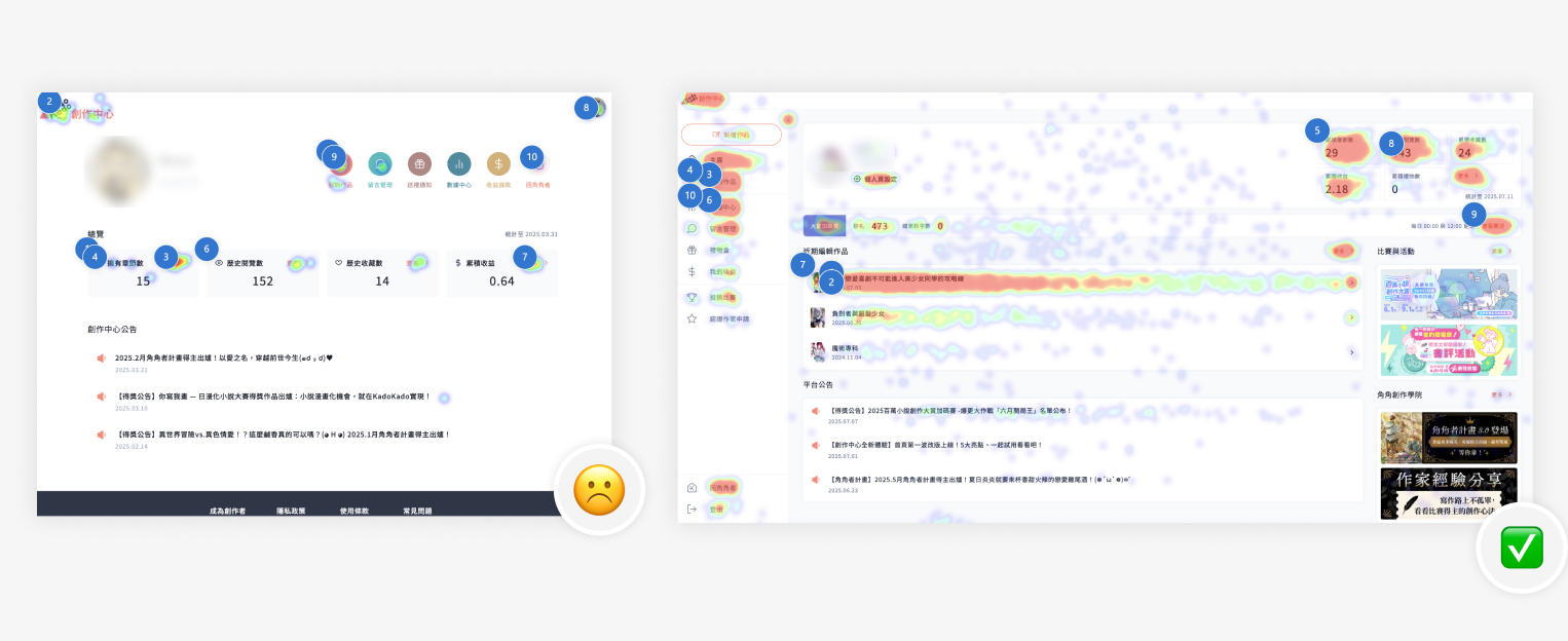
Every redesign decision traced back to a specific research finding. IPA identified exposure and publishing workflow as the highest-priority gaps. The lifecycle model confirmed that stages ① and ② — first draft to first publish — were the highest-dropout moments. Both pointed to the same answer: streamline publishing, surface promotion, make revenue visible. Those became the dominant elements on the redesigned homepage, not widgets or announcements.
Prioritized data visibility
Key metrics (Accumulated Views, Accumulated Revenue) prominently featured at the top of the dashboard. Addresses the core need of data-driven C1 creators — and makes monetization pathways visible for the first time.
Streamlined core workflow
Highly visible "New Work" button and "Recently Edited Works" list directly on the homepage. Publishing is the most-used daily task — it should be the first thing a creator sees.
Promotion and community hub
Dedicated sections for Competitions & Activities, Platform Announcements, and Creator Academy. Creators stay because of platform investment and community — these surfaces needed to be discoverable, not buried.
Revenue awareness
Accumulated Revenue displayed explicitly on the main dashboard. Previously required multiple clicks to find. Visibility alone increases engagement with monetization features.


Results & Impact
What moved
16.3%
Boost in chapter editing rate
Heatmap analysis confirmed all feature usage ratios increased
↑
Certified Author application rate
Button moved from 3 clicks deep to homepage dashboard
↑
Creator education blog usage
Creator Academy surface made discoverable from main dashboard
↑
Chapter editing duration and frequency
Streamlined workflow reduced friction in daily publishing loop
✓
Cross-departmental consensus achieved
Research findings resolved competing team priorities before a single line of design was committed
Learnings
What this taught me
Research as organizational alignment tool
The Creator Center had become a political problem before it became a product problem — every team believed their feature request was highest priority. User research gave me a neutral, evidence-based framework to facilitate cross-team alignment. When the IPA data showed creators cared most about exposure and publishing workflow, it stopped being my opinion — it became the users speaking. That reframe changed the conversation entirely.
In-depth research can fit into a busy PM roadmap
This project proved that strategic research doesn't have to slow product advancement. By designing a focused, mixed-methods study — survey for breadth, interviews for depth, IPA for prioritization — we generated actionable insights in a compressed timeline. A design background helps here: understanding how to structure research that produces synthesis, not just data.
Creator churn is a signal worth investigating before it becomes a trend
C4 — the creator who left and came back to ask if Kadokawa was hiring — was the most revealing interview. Disengaged users who've already left carry the most honest feedback, because they have nothing to lose by being direct. Understanding why they left often reveals structural problems that active users have learned to work around. That's the feedback you can't get from a satisfaction survey.
Next Case
Kado+ Subscription →